
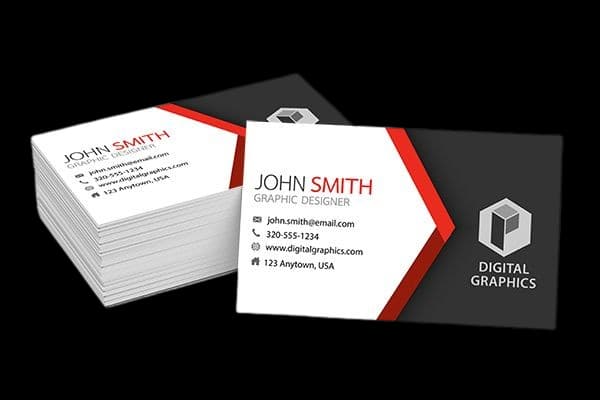
Start with how the card will be used
A business card is often the first printed item someone keeps after meeting your team. Before choosing a paper, think about who will receive it and how you will hand it out. A card used at a busy trade event needs to be easy to read and durable. A card shared with a smaller group of clients can make a stronger impression with a more tactile stock or a refined finish.
Your paper should support the job of the card, not distract from it. Prioritize a clear name, useful contact details and a logo that remains legible at a small size.
Understand paper thickness and feel
Paper weight is one useful way to compare card stocks, but the finished feel also depends on the paper type and any added layers. A heavier stock generally feels firmer in the hand, while a lighter option can suit large quantities or a simple, economical handout.
If you are unsure, ask to compare available samples before confirming a bulk order. Feeling the stock yourself is more useful than choosing from a weight number alone, especially when the same design will be used across multiple customer touchpoints.
Choose a finish that matches your brand
A matte finish gives a restrained, low-glare appearance and is comfortable to read under bright indoor lighting. Gloss can make colours look more vivid and offers a smooth surface. Special finishes such as foil or spot UV can draw attention to a logo or a small detail, but work best when used selectively.
Consider the impression you want to create. A clean professional services brand may prefer a simple matte card, while a product or creative brand may use a stronger colour or one carefully chosen accent finish.
Prepare artwork for a clean result
Keep important text and logos away from the trim edge, use readable type sizes and check that contact information is current. If the design uses a full-bleed colour or photograph, provide artwork with the required bleed so small cutting differences do not leave an unintended white border.
Review a proof at actual size before printing. It is easy to miss tiny text, spacing problems or an outdated phone number when artwork is viewed zoomed in on a screen.
Order the quantity you can use
A larger quantity can lower the per-card cost, but only order what you can use before your details or branding change. New phone numbers, team members or a refreshed logo can make old stock obsolete.
The right business card is a balance of readability, feel, finish and budget. Share your intended use and quantity with your printer to compare options that fit your brand and timeline.